
Bowen Estate
CLIENT
Bowen Estate
PROJECT
BREIF
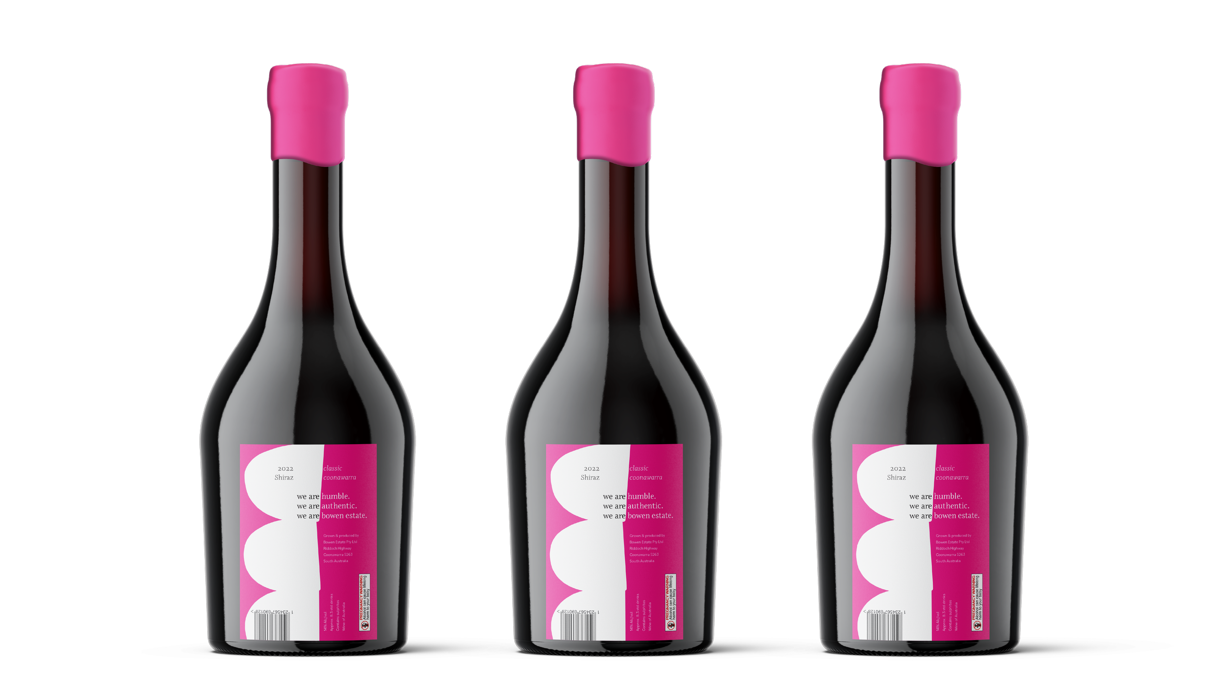
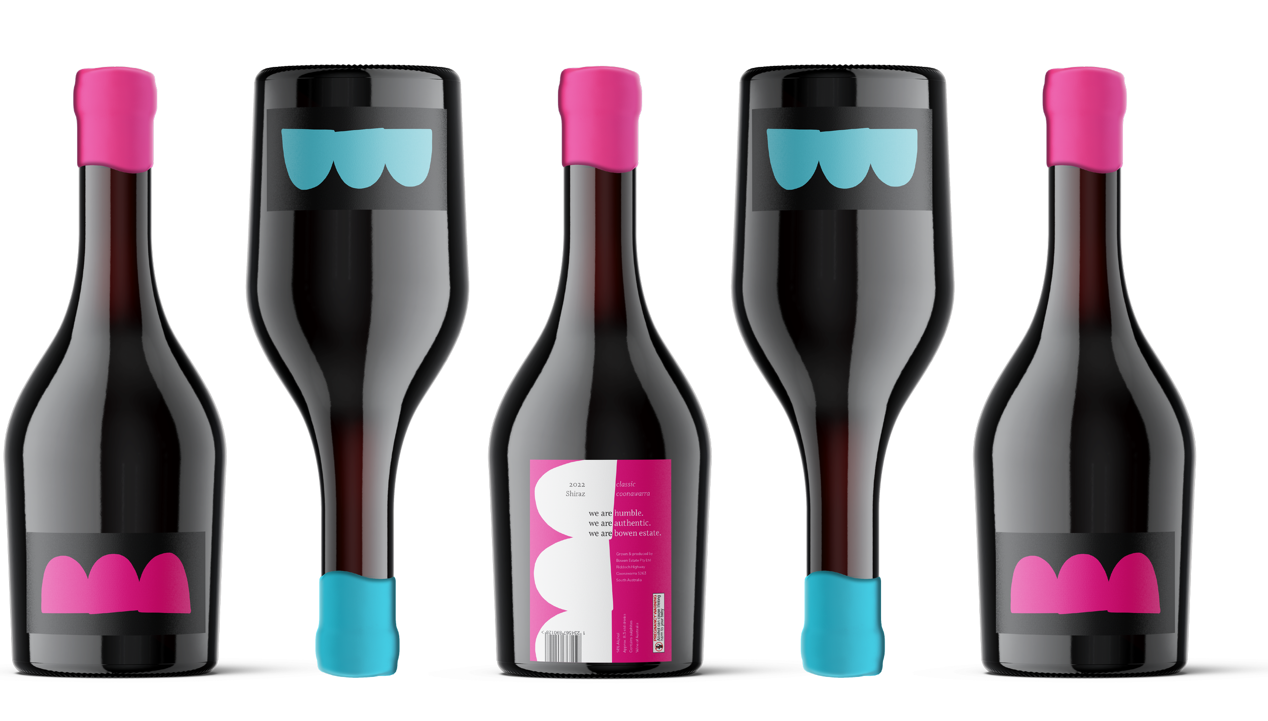
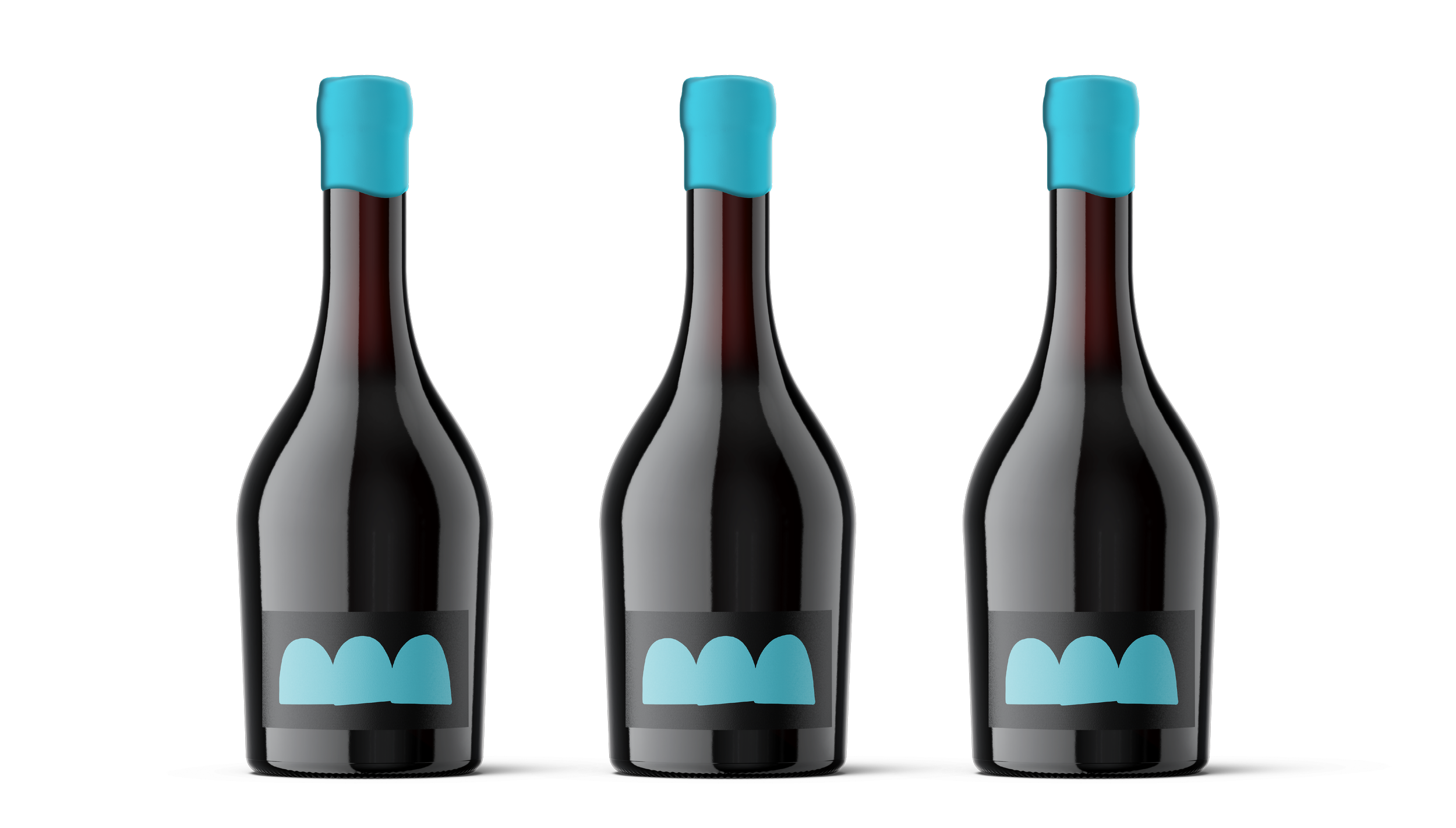
Part one of the project was to redesign the Bowen Estate wine labels to better appeal to a younger target market.
SOLUTION
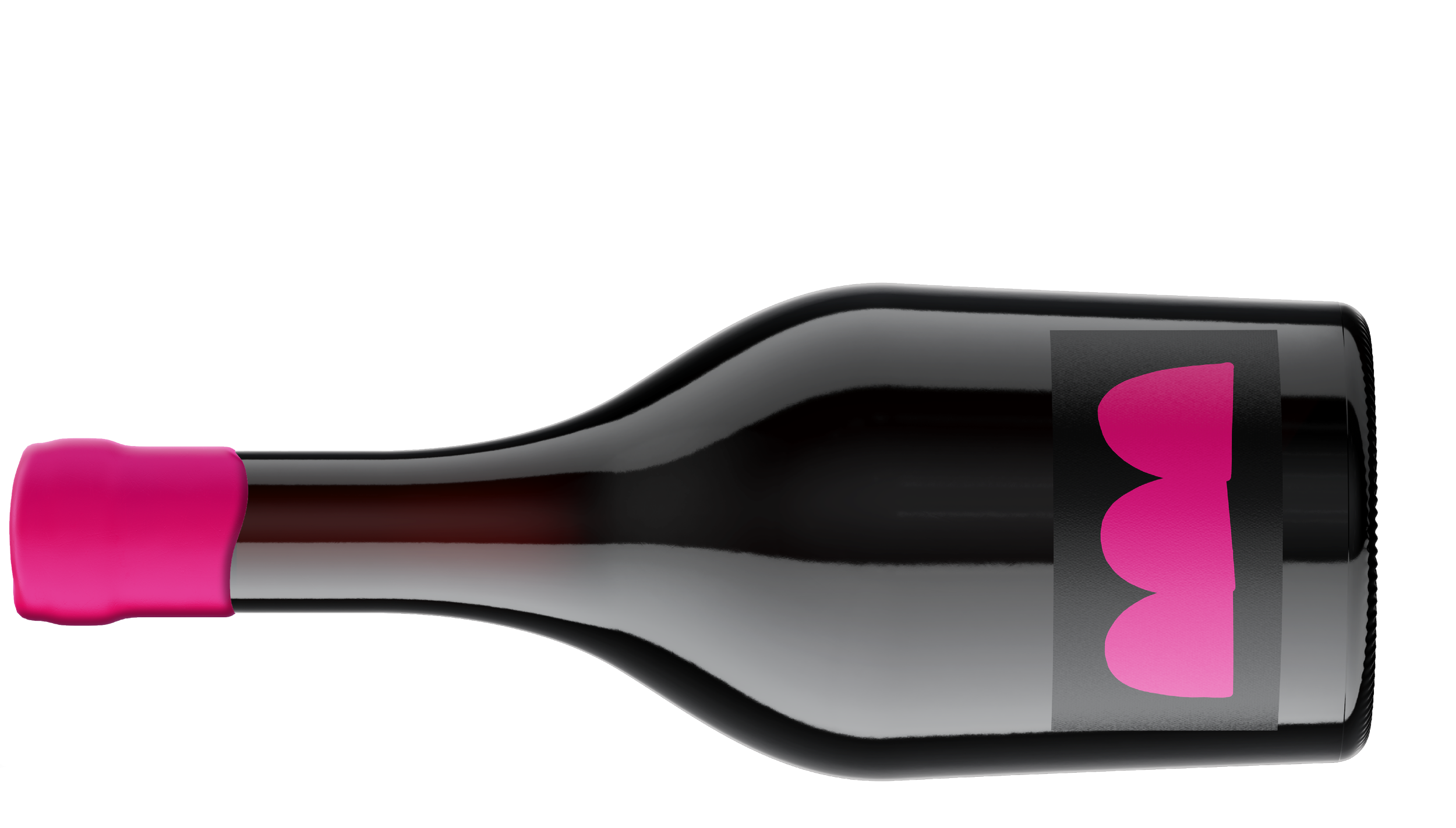
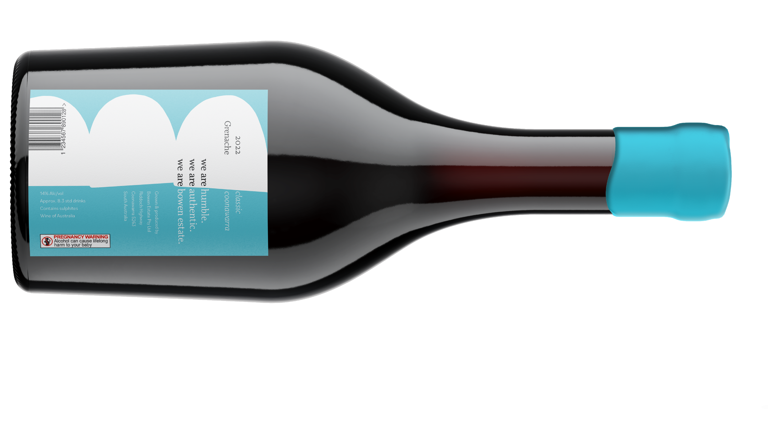
The new label features a bold, distinctive shape that encapsulates three key elements at the heart of Bowen Estate wines:
Family legacy: The three arches represent the three Bowen family members who own and operate the Winery.
Core values: The organic outline of the shape reflects the Bowens’ deeply held value of humility.
Winemaking tradition: The arch-shape represents the arch cane trellis system the family has used since 1989, a method integral to their winemaking style.
The bold colour palette is designed to resonate with the younger target market and enhance the wine’s shelf presence.
The full process can be viewed here.
*NB: This was created for educational purposes only.
SCOPE
Packaging design | Ideation | Print-ready files