Under One Roof
CLIENT
Designed as part of my ‘Royal College of Art: Executive Education - Editorial Design’ studies
PROJECT
BRIEF
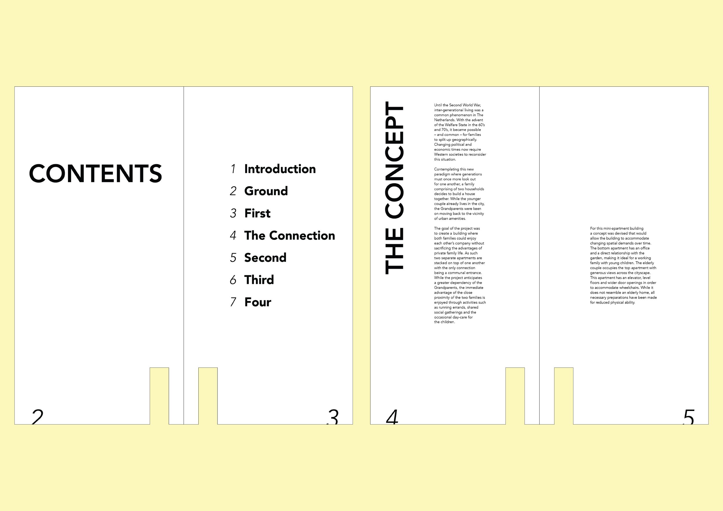
The brief was to choose a designer whose work I admire and create a publication with a cover, and a minimum of 5/6 double page spreads. There was full creative freedom in the relationship between the text and type, the best format for the subject, and the publication’s architecture.
I based my project on Amsterdam’s ‘Three Generation House’ designed and lead by architect Auguste van Oppen.
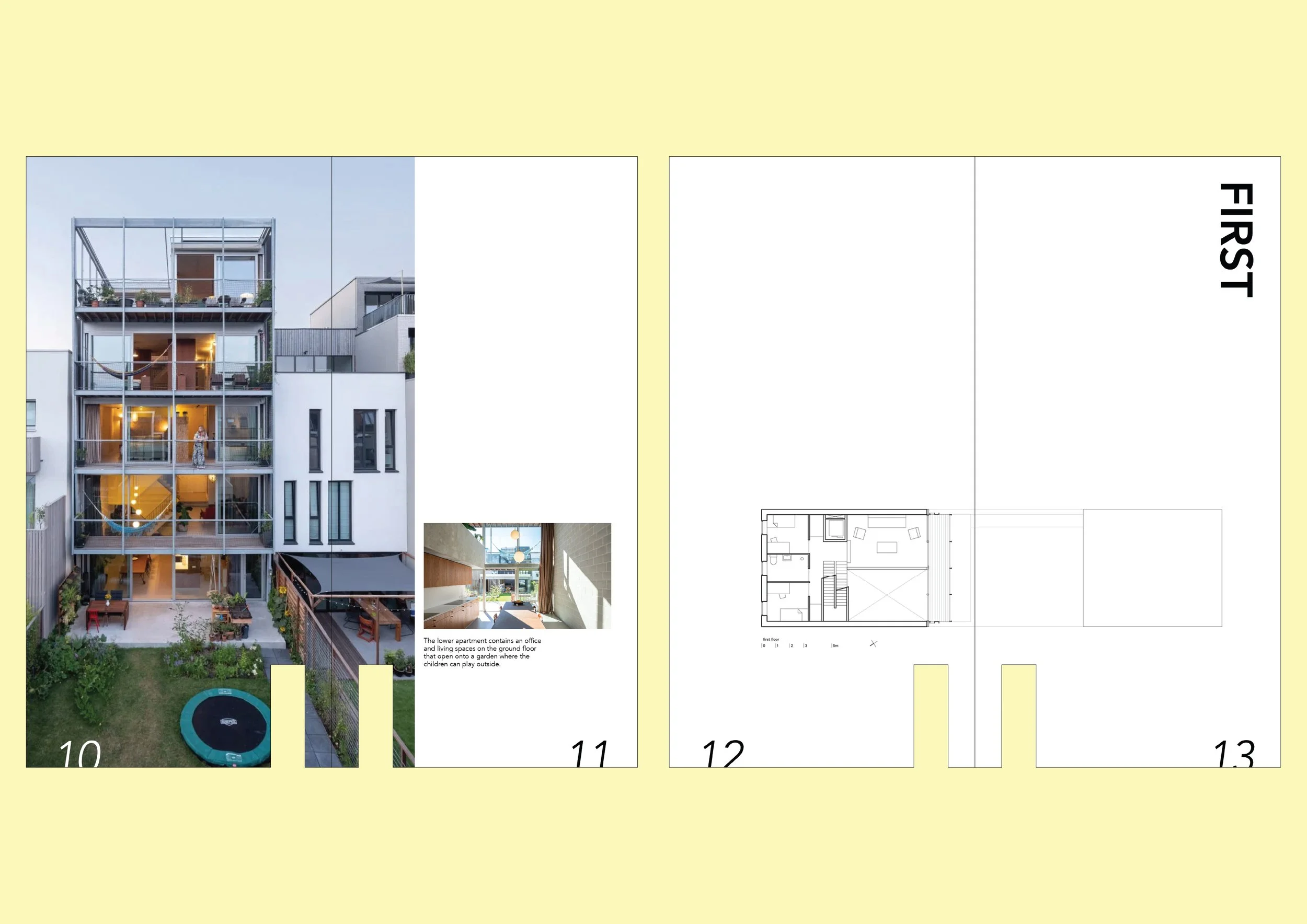
The home, housing two families, was designed and built whereby both families could enjoy each other’s company without sacrificing the advantages of private family life. The house adapts as the needs of both families will change.
My goal was to celebrate the thoughtful architecture of the home through the publication itself. Every aspect—from the size and shape to the grid system and layout—was carefully considered, ensuring that the design of the book is as distinctive and intentional as the house it showcases.
SOLUTION
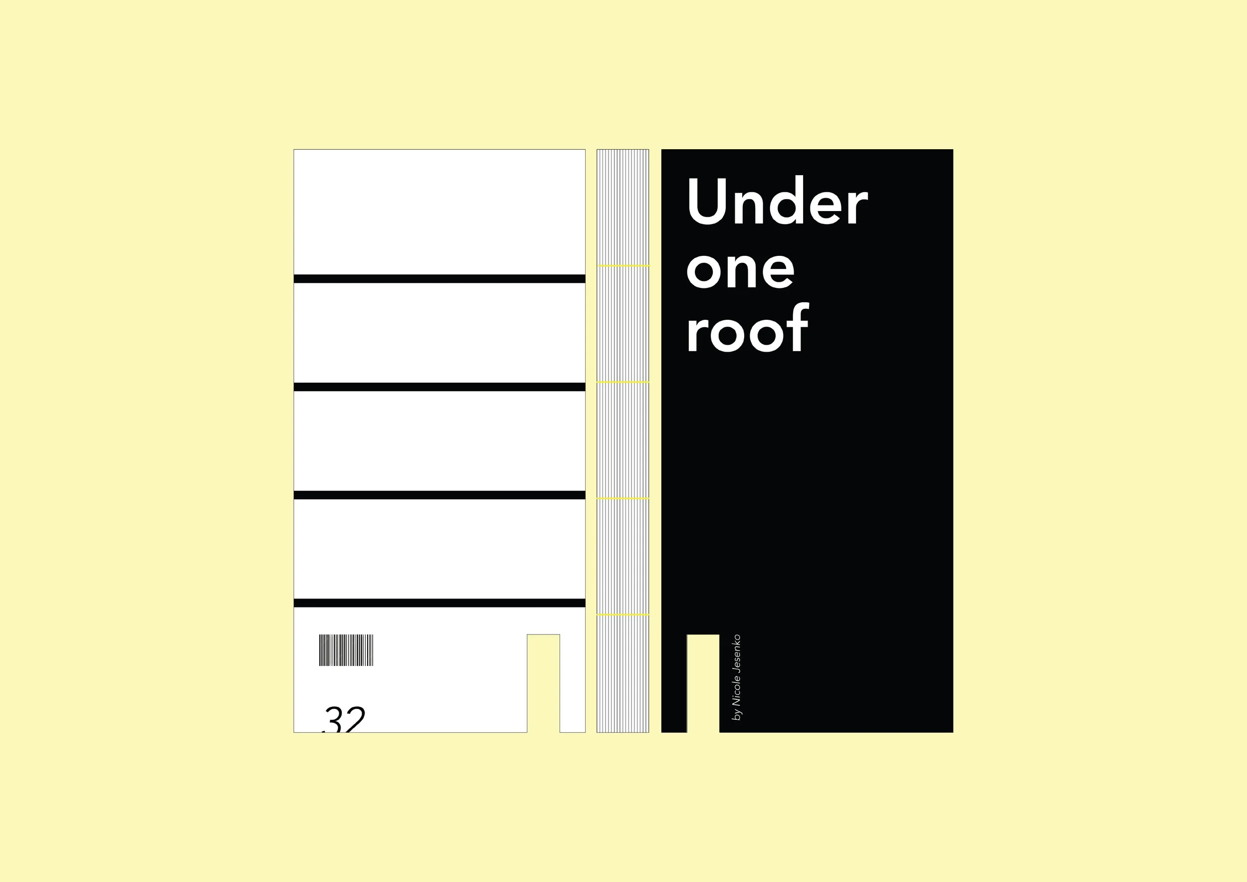
The book’s design is a direct architectural reflection of the home it documents, creating a powerful visual impact and immediate ‘pick up’ appeal. The unique die-cut entrance mirrors the home’s shared entryway, inviting readers into the narrative just as the doorway welcomes occupants. This clever use of die cutting not only grabs attention but also reinforces the book’s connection to its subject.
The book’s modular grid layout is inspired by the south-facing facade of the house, which is defined by four columns spanning five stories. This structural rhythm is echoed in the book’s internal grid, providing both visual coherence and a subtle nod to the home’s architecture. The back cover further celebrates this aspect, reinforcing the book’s unity.
The book’s proportions (29cm x 14.5cm) are intentionally matched to the home’s own dimensions, making the book itself a scaled representation of the building. The grid system draws from the south-facing facade, with its five levels and four distinct rectangles on each floor/level, created through the use of metal coloumns —an original and creative interpretation.
Page numbers bleed over the page edges, visually representing the family’s lives as they span across the home’s different levels. This detail adds a playful and thoughtful layer to the reader’s experience.
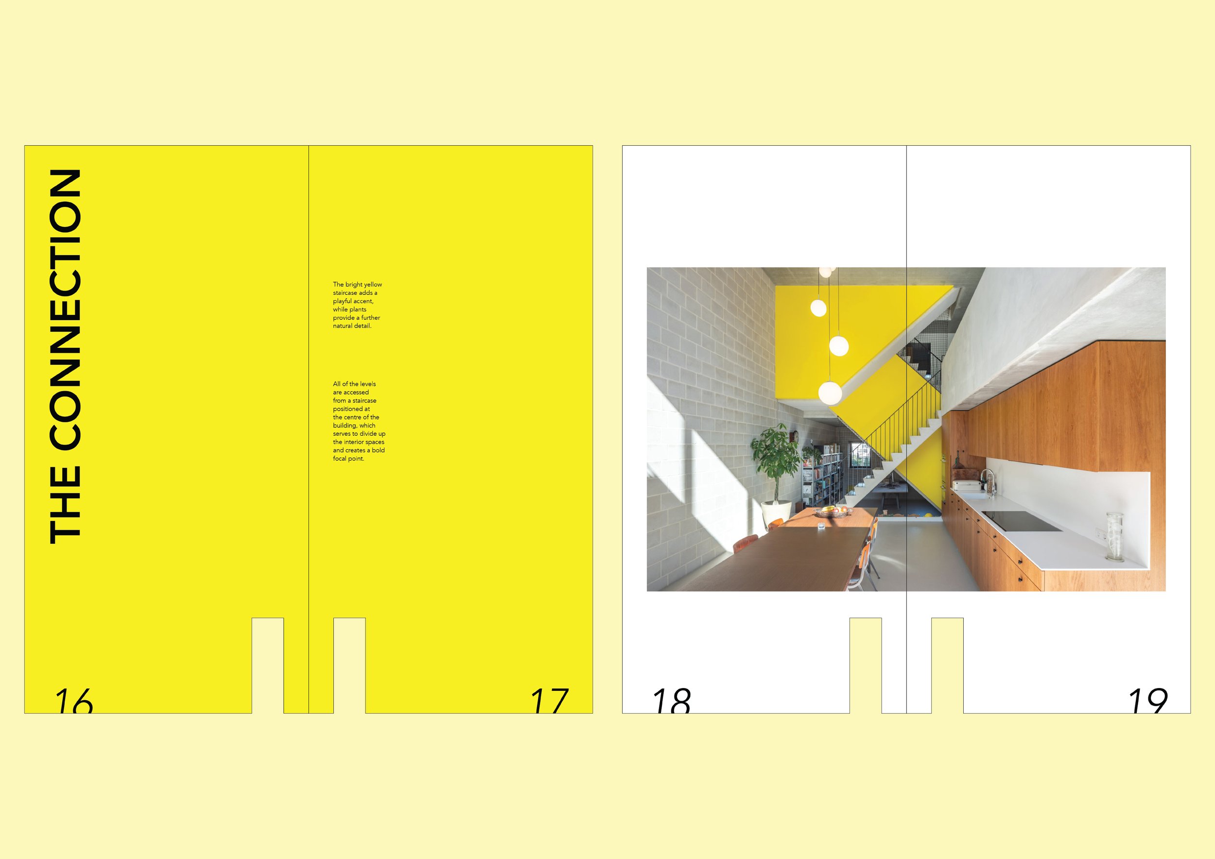
The color palette is primarily black and white, with a striking exception: the book’s center section bursts into bright yellow. This color choice is inspired by the home’s vibrant yellow sculpture, a central feature that transforms vertical circulation into a focal point. The yellow becomes a visual and conceptual anchor within the book, just as it is in the home.
Typography is set in Amsterdam Sans, a contemporary typeface developed by Thonik and Bold Monday for the City of Amsterdam, lending the book a modern and distinctive character. I was unable to get this typeface from the designers; so Avenir was used as a substitute, for the purposes of this project. Prior to 2022, Avenir was the font used by the City of Amsterdam.
The book is bound using the coptic stitch technique, leaving the spine exposed. This not only showcases craftsmanship and technical excellence but also references the home’s glass-clad south facade. The use of yellow thread in the binding pays homage to the iconic yellow structure at the heart of the building.
Overall, this design is highly original and meticulously executed, with every detail thoughtfully considered. It represents a significant departure from conventional architectural books by transforming the book itself into an extension of the home’s architecture—an innovative approach that sets a new standard within its market.
SCOPE
Ideation | Concept development | Publication design | Print-ready files
Created for educational purposes only